Public Health Navigation
Navigation Wireframes
Project Completed
April 2026
Task and Planning
The task at hand was to refurbish and refine the current navigation on the NI Public Health Agency Website. The navigation was viewed as outdated and difficult for users to manage. Users were unable to find specific pages, documents and were constantly finding themselves lost. PHA also wanted to introduce a public and professional section on the site for medical professionals to access the content they needed quickly and with ease. The task then was to redesign from the ground up a brand-new top, mid and bottom level nav on the site while also improving on page-to-page navigation. A challenging position to be in but an exciting one, nonetheless.
Ideation and Research
Various professional sites were used as a baseline of how we wanted the nav to look and how it could work with a site brimming with a huge amount of medical content. We looked at the UK.GOV website and public health sites in other countries to gather information on how a new professional nav is used for sites with massive amounts of info and content. I then constructed a simple mind map of ideas to include in the new navigation such as an advanced search, filters and an additional nav level. After some discussions and considerations, it was time to move onto the sketching process to produce various concepts to showcase for a future digital wireframe model.
Sketching
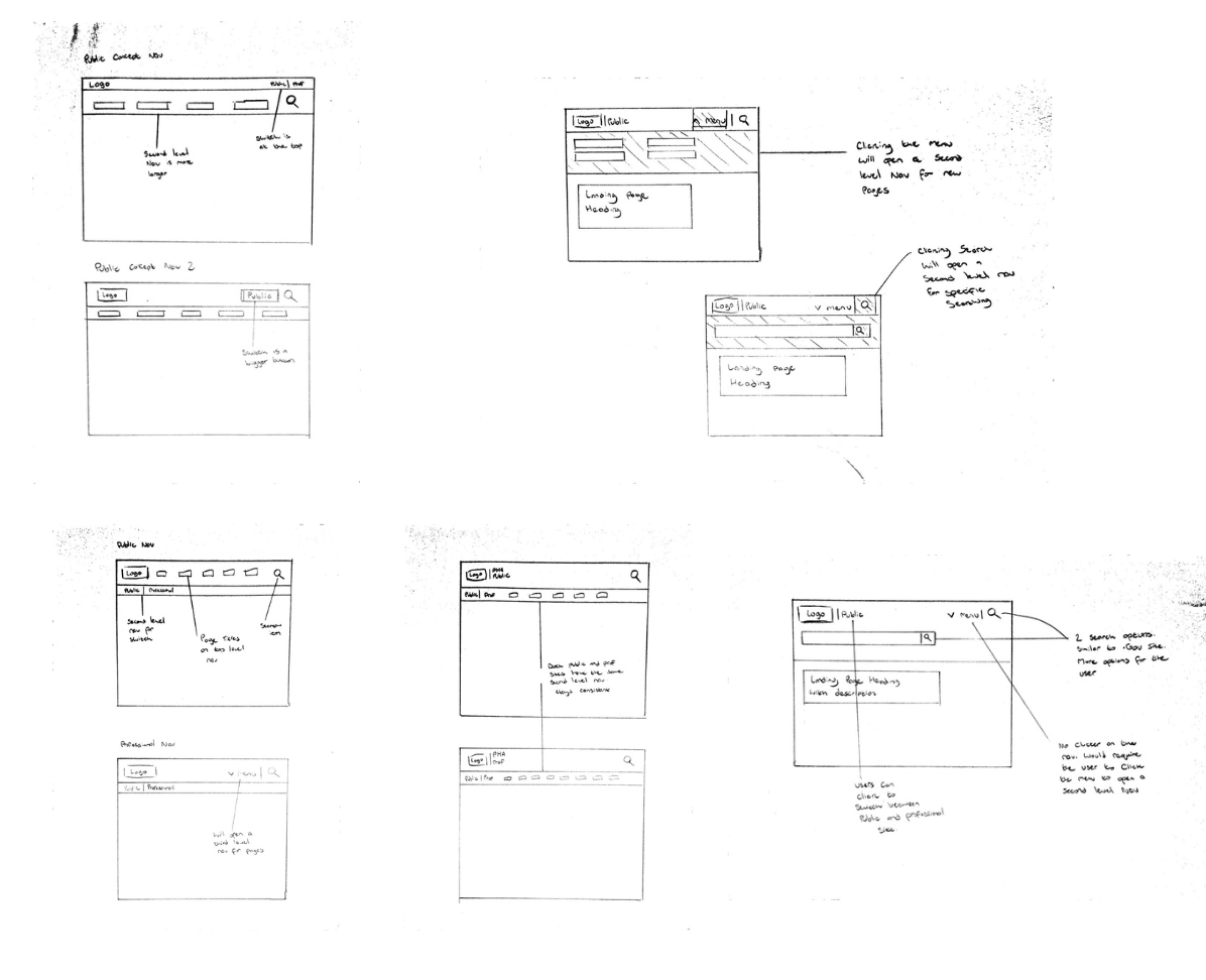
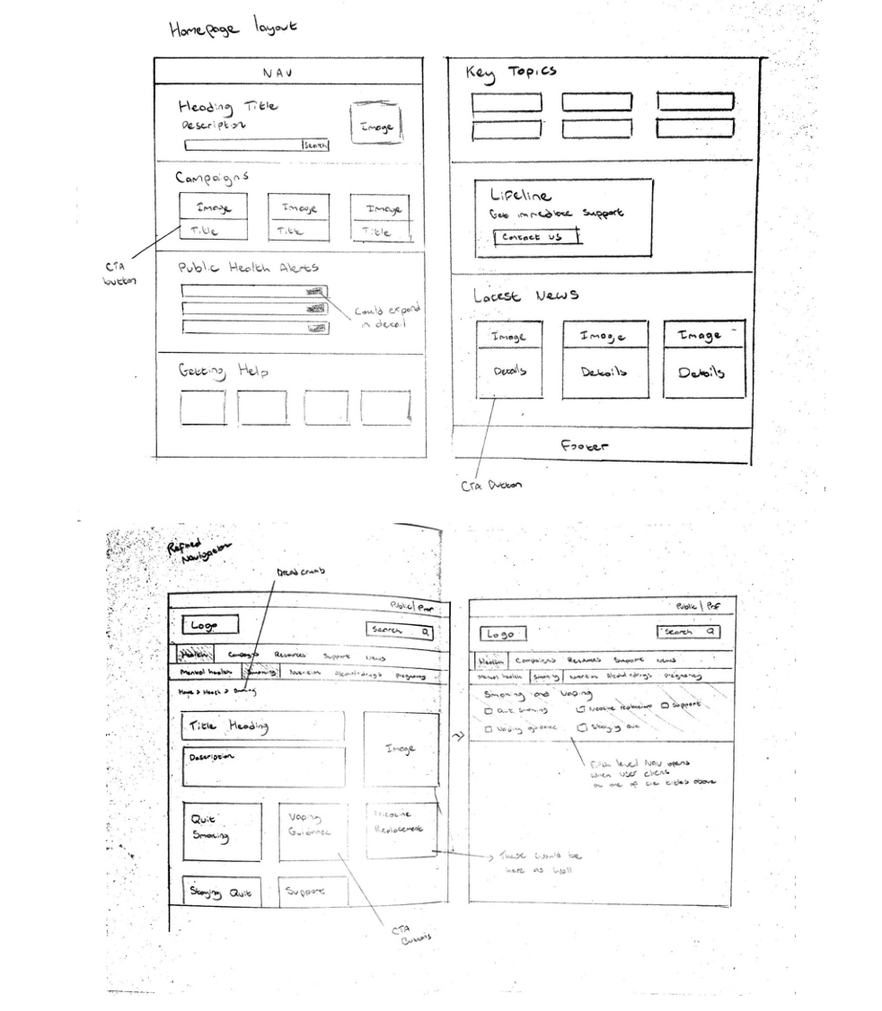
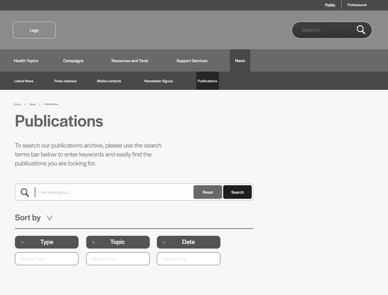
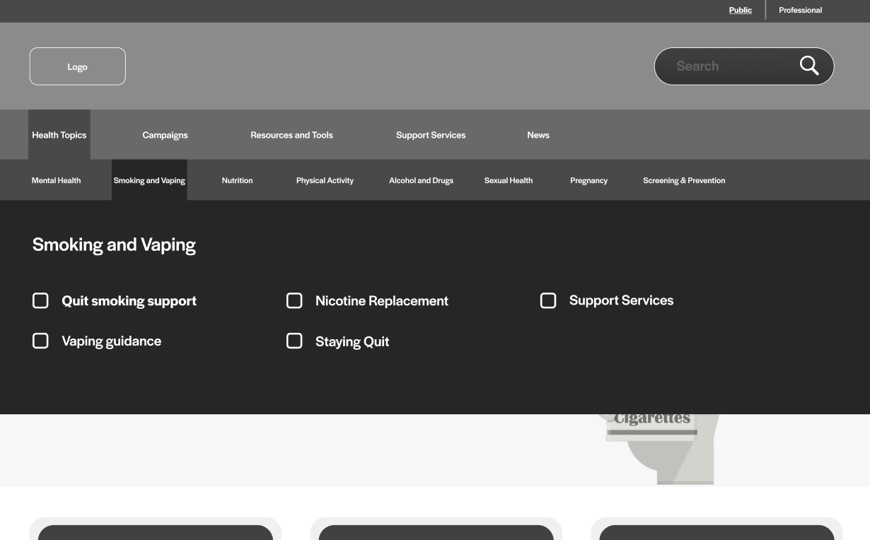
I produced multiple different concepts as to the structure of the navigation would be displayed including the new necessary features. One concept was inspired by the .GOV website and prioritised the ‘search’. Another concept was more focused on the key headings for the user to identify easily. At least 5-6 concepts were produced at this time to be looked at and analysed for strengths and weaknesses. After some considerations and analysing, it was clear we needed more levels of navigation than previously thought to bring about a clearer navigation, so the user doesn’t get overwhelmed or lost. The final concept that was greenlit for the digital design process was a three level nav system on the homepage that would open an additional nav layer to showcase the sub level sections of the main sections. The site switch from public to professional was identified to be a simple top level nav and not a larger call to action button like on previous sketch concepts.
Digital Design
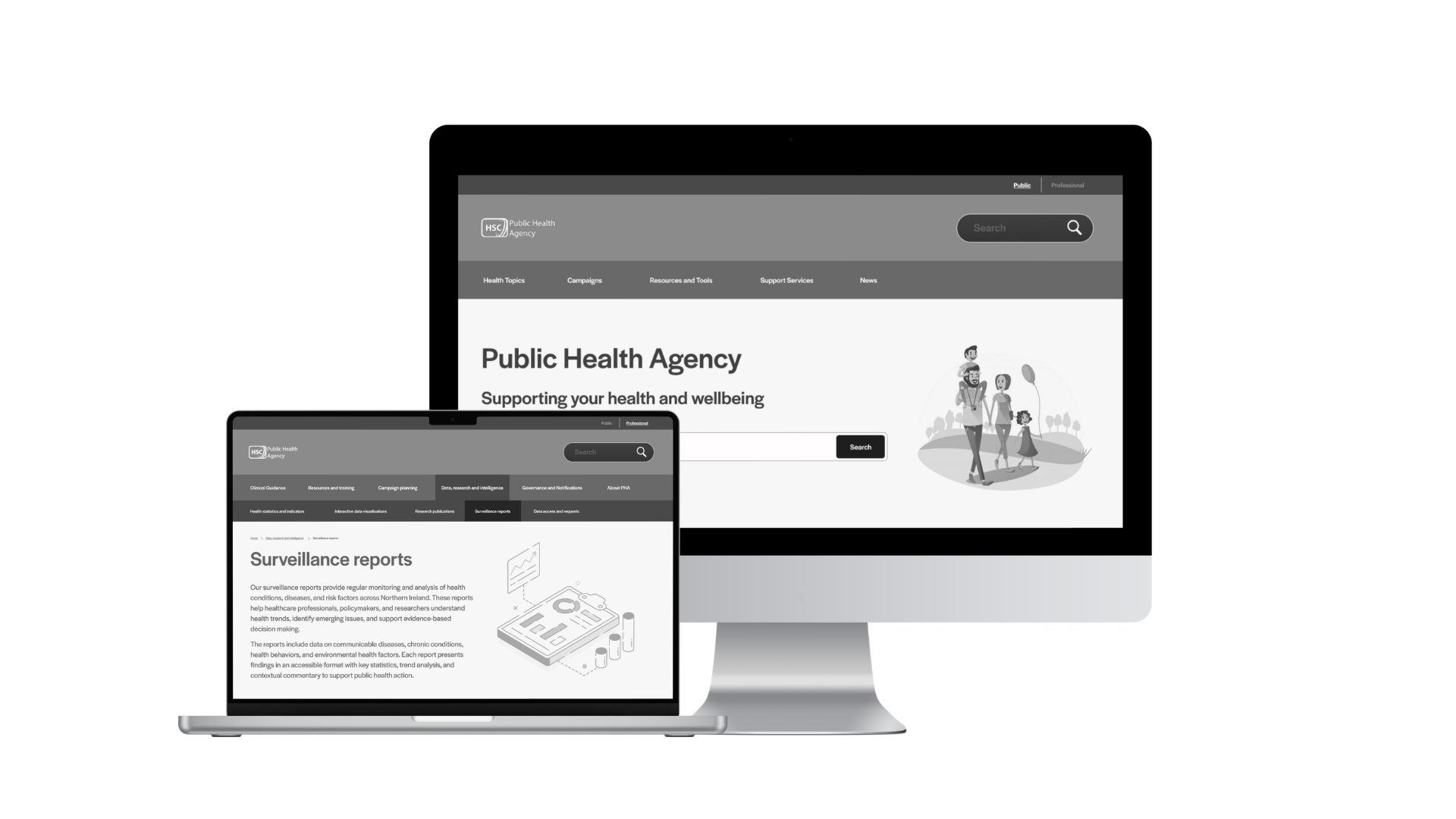
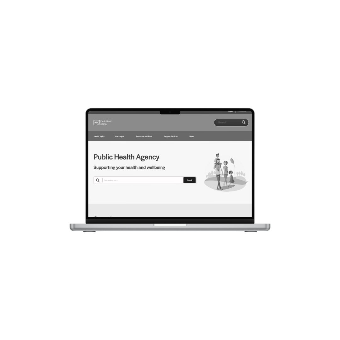
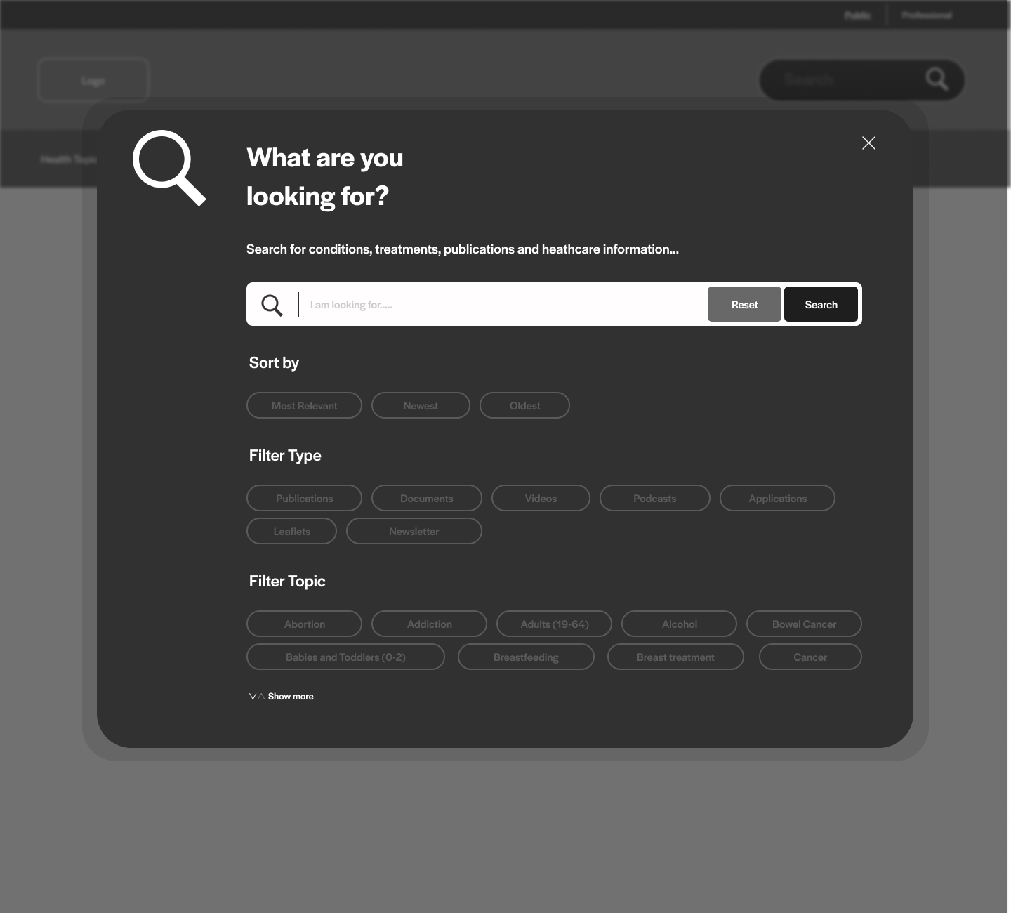
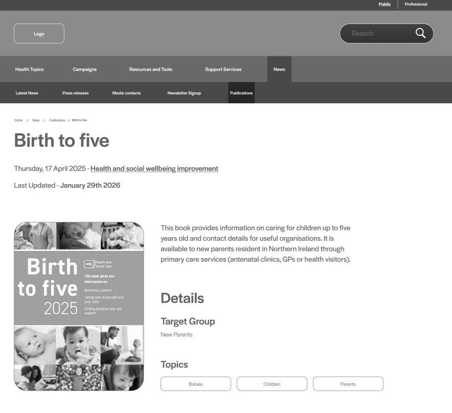
The digital design process was developed on Figma. This process featured several pages refined and redesigned alongside the navigation to showcase not only a better structural design but an aesthetic one too. This stage was the quickest to accomplish as there were several sketch concepts produced beforehand. There was no need to recreate the long process via digital. It was quite streamlined at this point, and my focus was on adding additional design features like the advanced search on the homepage to demonstrate the positives of having a smarter search section for both the public and medical staff.
Challenges Faced
Several challenges popped up during this task, the main one being concerned with the overwhelming nature of having 5 layers of navigation on a website and designing it in a way not to be confusing or overwhelming. Thankfully this challenge was overcome before even designing on Figma, so I knew exactly how it would look and operate on a desktop. Another challenge was time constraints. I didn’t get an unlimited amount of time to go back and forward on specific ideas or concepts, so I had to adapt to the quick nature of this process and not to get overwhelmed myself. I was very pleased to have completed this task not only on time, but with a final design that feels new, sharp and easy to navigate.
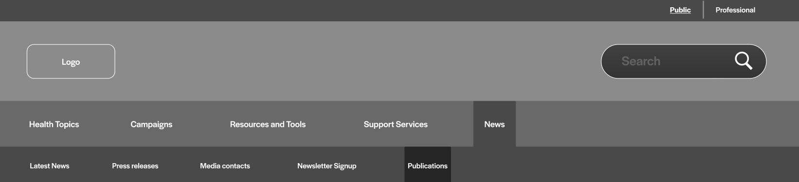
Final Design