Element52
Educational App
Project Completed
February 2021
Task and Planning
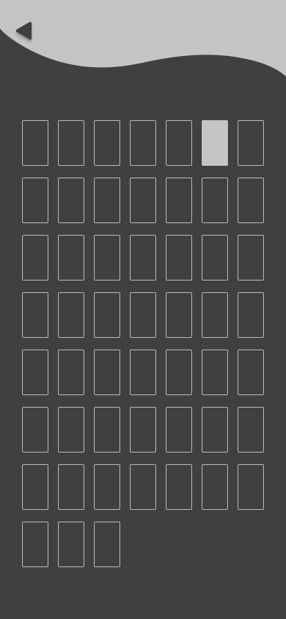
The task was to produce and design a working prototype application to help students with learning the periodic table. I decided to create an app that uses the elements of the periodic table like a deck of 52 cards. The user can collect new cards by playing quizzes and testing themselves with an easy to use on the go app.
Ideation and Research
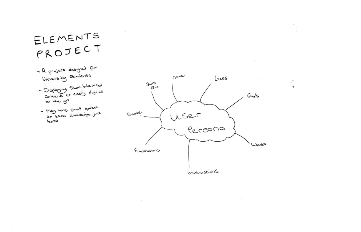
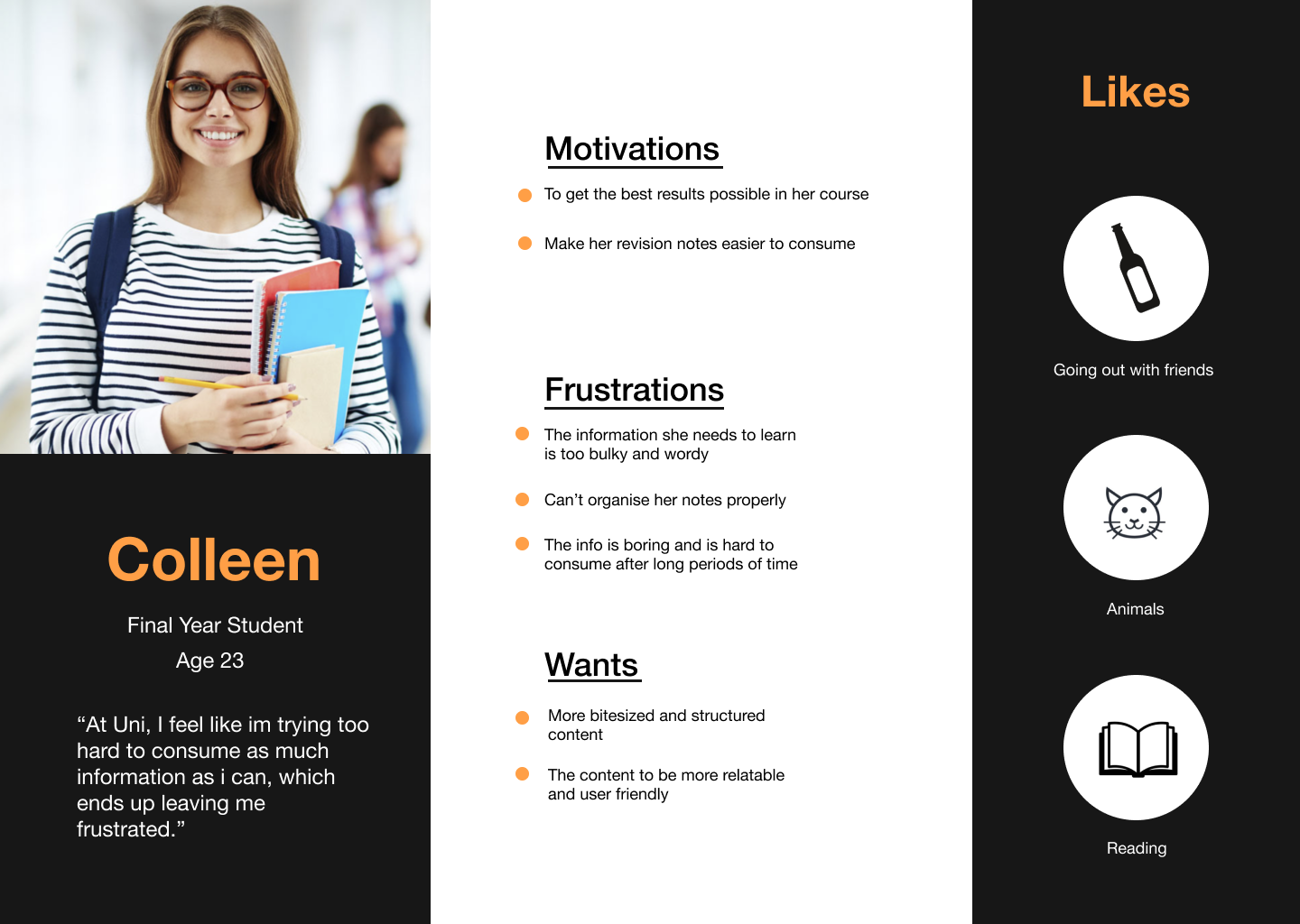
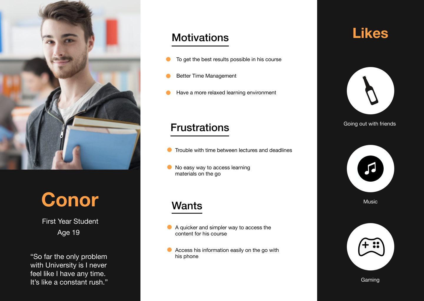
The idea itself was a specific task designated to the class so to start off; I produced a user persona of a university student. The user persona displayed that they were constantly busy juggling schoolwork and university life away from home and needed something quick, reliable and on the go. This led to the idea of creating an app that would provide short, bitesize content to give students a chance to learn at their own pace. Some apps that I looked at for inspiration were Duolingo and Quizlet for layout, structure and aesthetics.
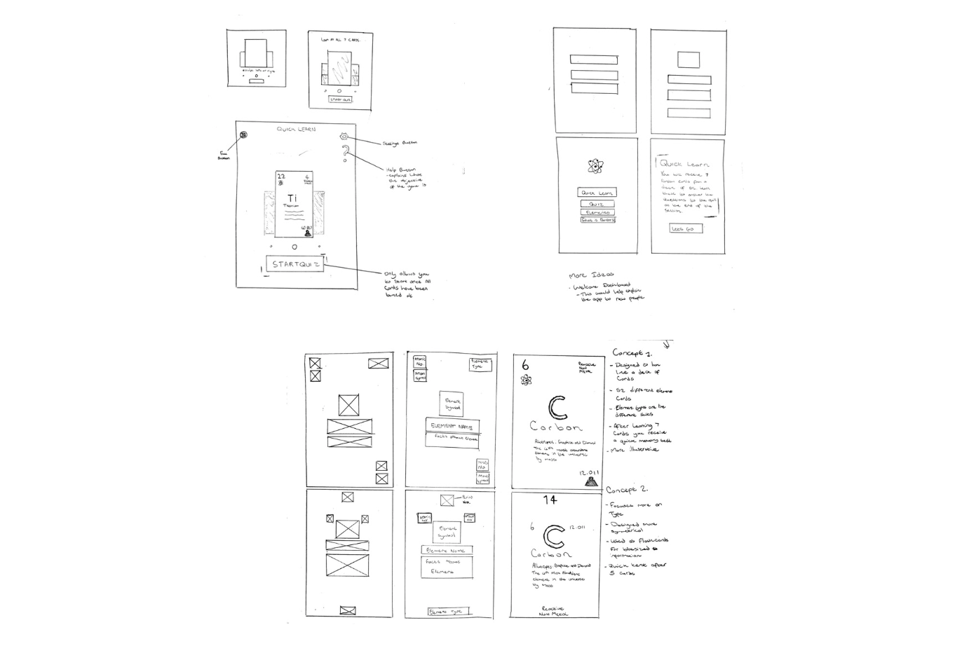
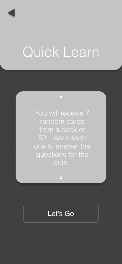
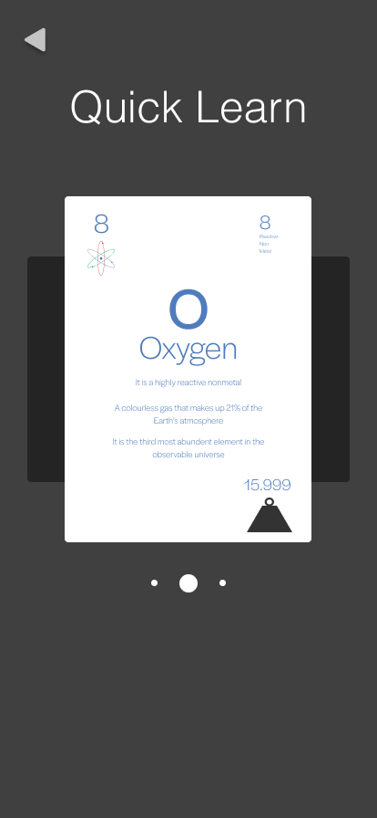
I created two main concepts for how the cards would look on the app. One focused on illustration and the other on type. I went with the illustrative look due to it popping more visually and a better representation of actual playing cards. I then refined the sketches down to various screens such as the home screen, onboarding and the quick learn screen. This gave me an idea of where certain icons and buttons would be placed for the digital design stage.
Sketching
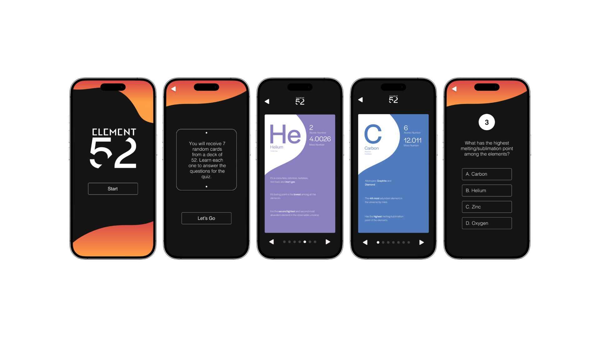
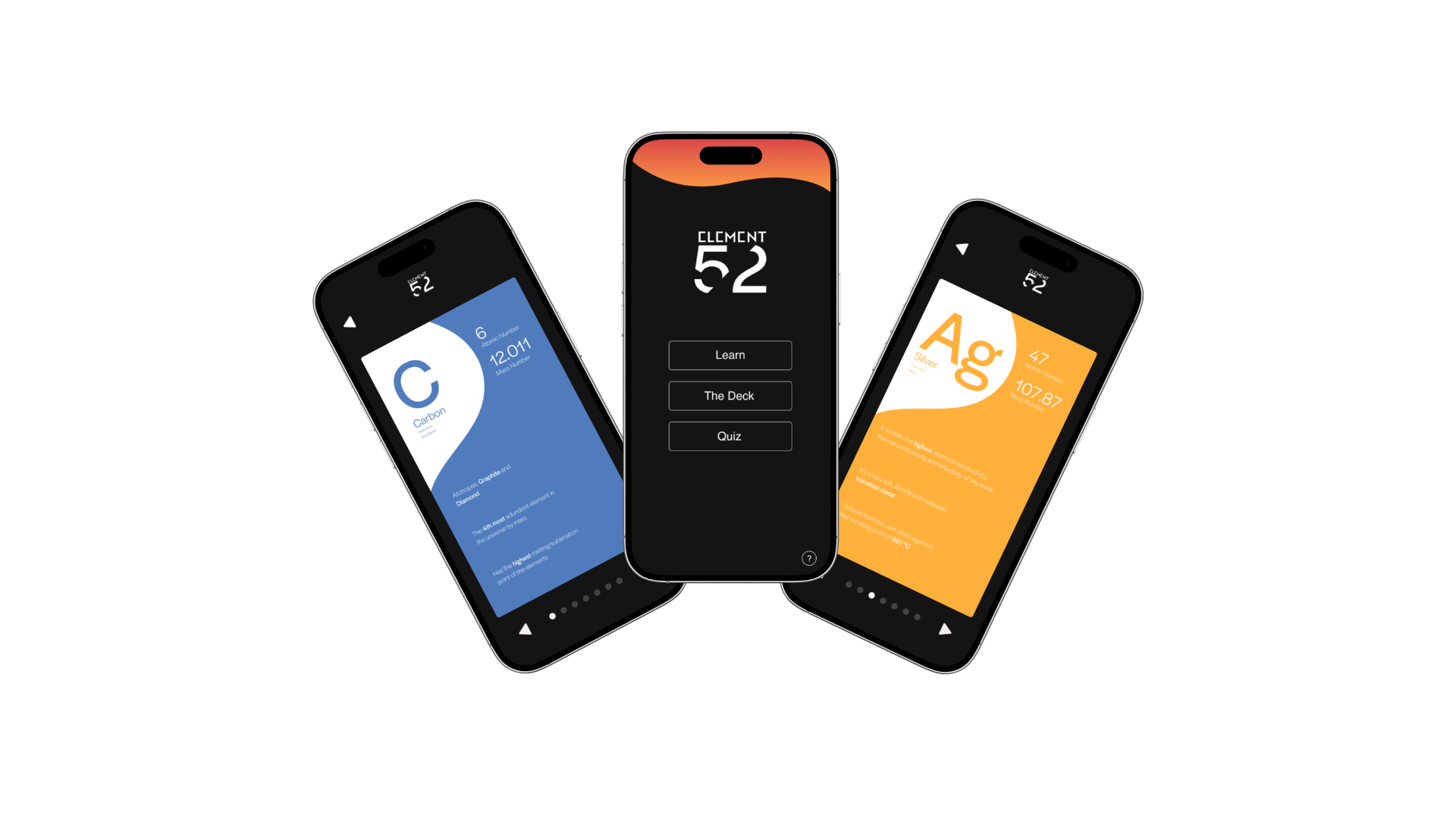
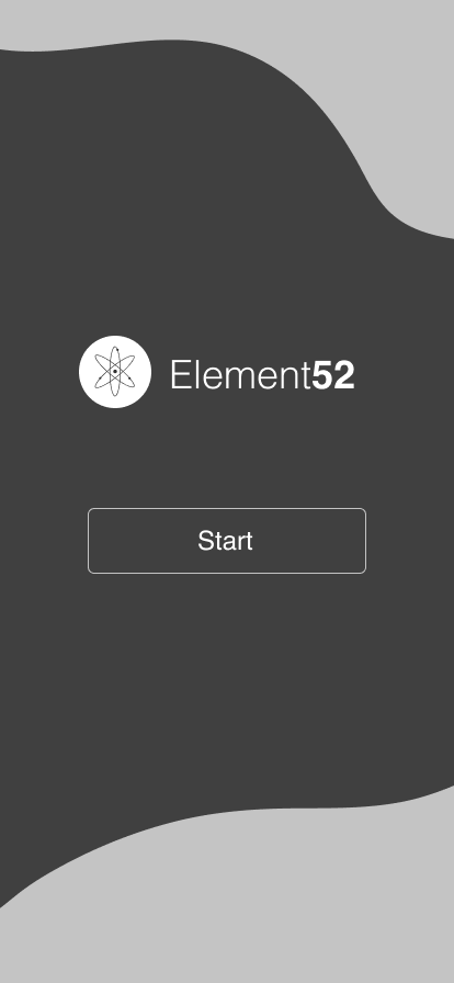
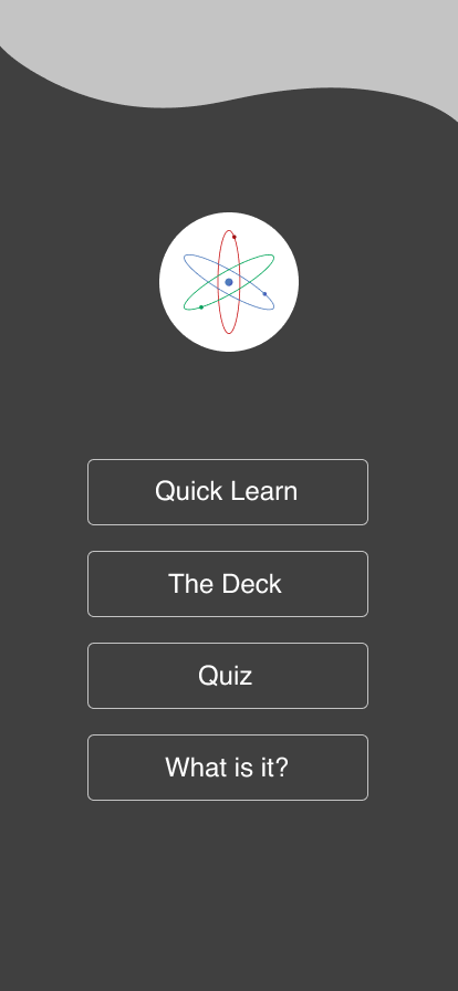
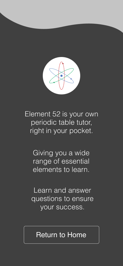
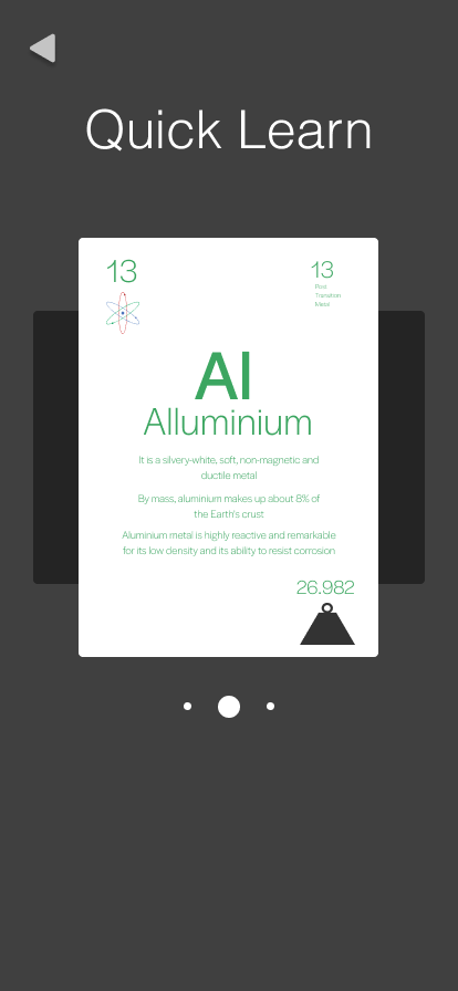
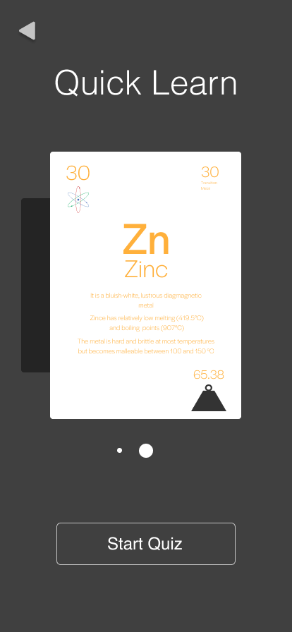
I designed and prototyped the app using Figma. I created learning, deck, quiz and onboarding sections to provide all the essential needs for a student trying to learn the elements and understand the app. Two versions ended up being produced for my app, the latter being the final version due to problems arising during the digital design process. The final version came out stronger and more visually striking than the older version. I was very pleased with the outcome.
Digital Design
Challenges Faced
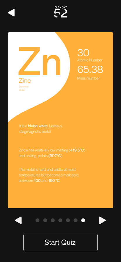
The challenges I faced during the design process mostly stemmed from the digital phase. I wasn’t happy with how the element cards looked digitally as opposed to the sketches produced previously. They looked too bland with not enough colour to make them stand out visually. I redesigned them with a ‘type’ focused version and added more colour to them to give each element card its own personality. I also faced problems with the branding; specifically, the logo. The original logo felt too safe and generic and didn’t have much to say. I redesigned the logo to have a sleek futuristic look and give the app more personality. I was very pleased with the changes made as it produced a much stronger product.
Final Design